
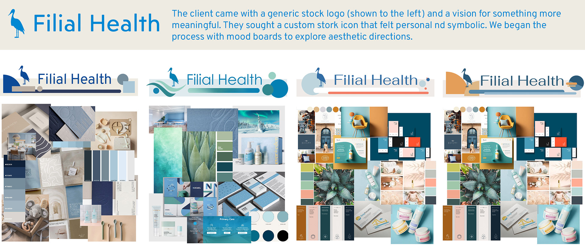

The Brief
Filial Health needed a brand that broke away from the sterile, impersonal aesthetic typical of medical tech startups. As a fertility-focused company the goal was to strike a balance: professional and credible, yet modern and warm.
The Solution
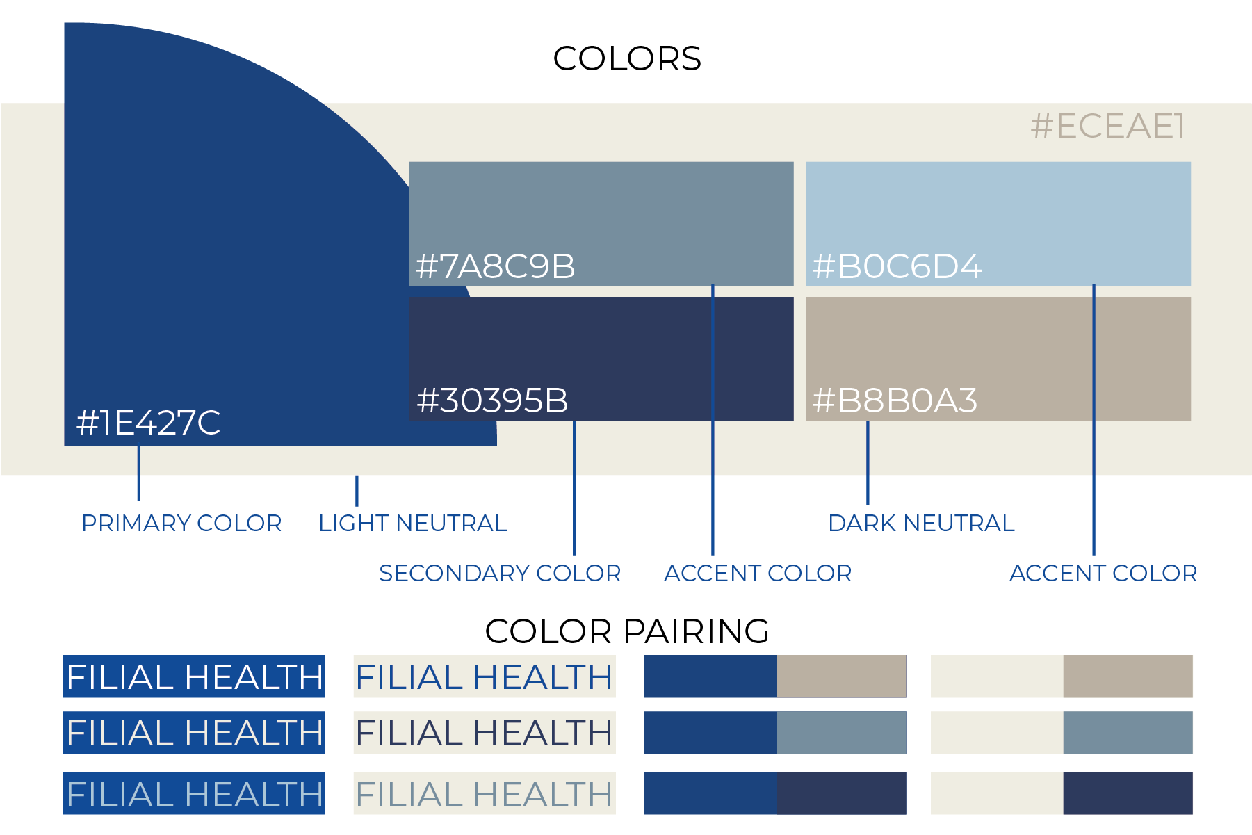
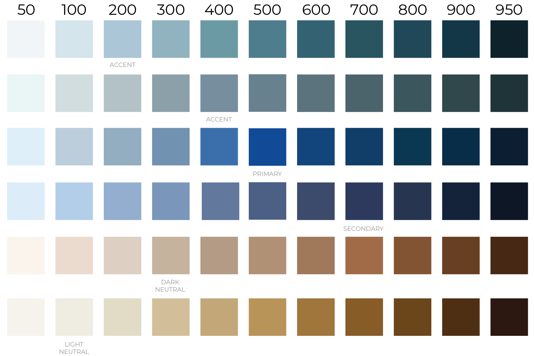
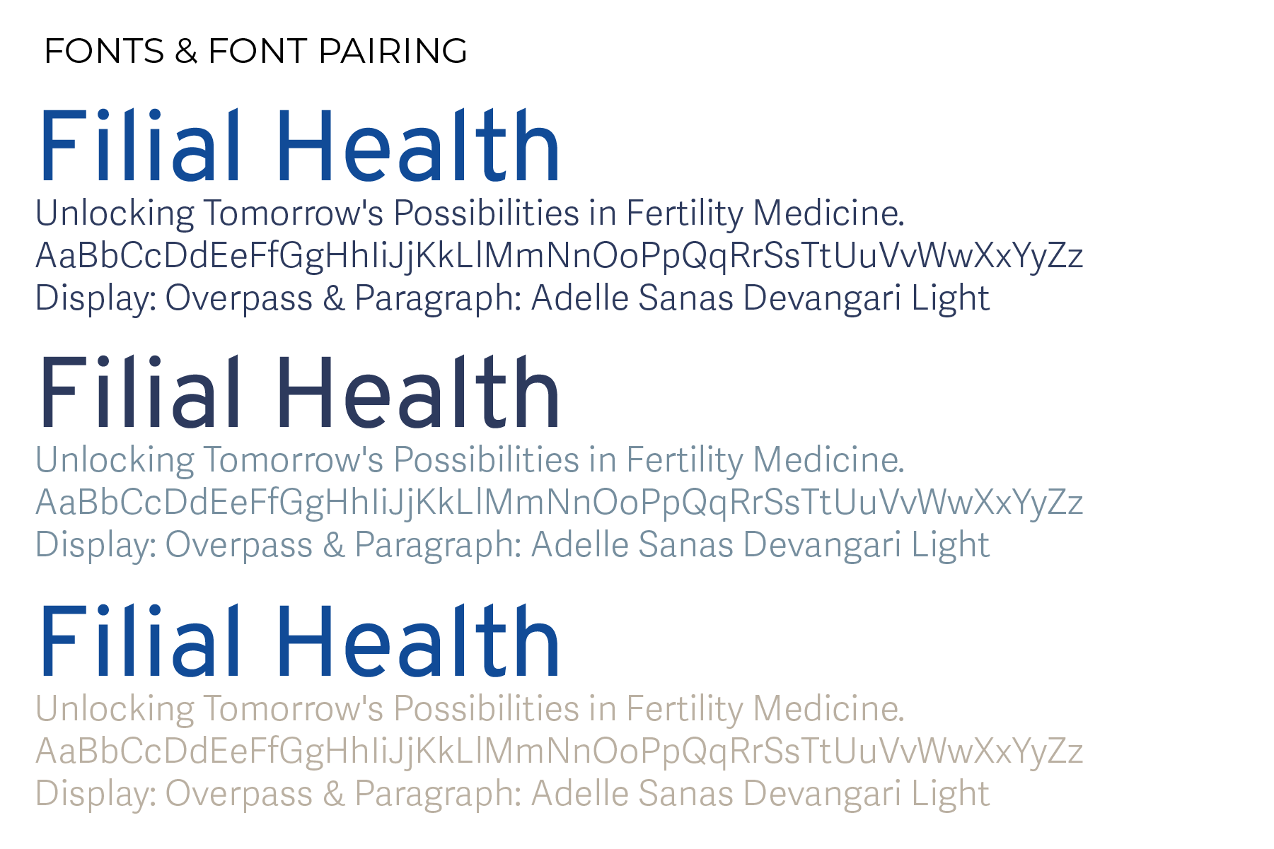
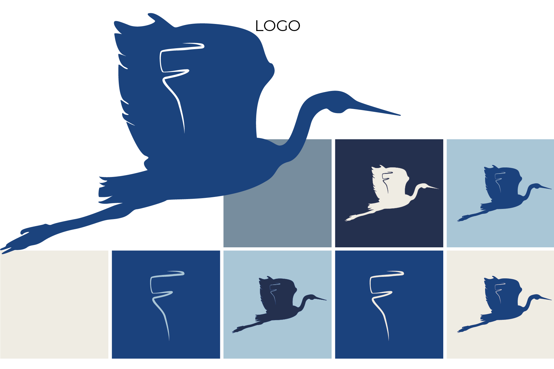
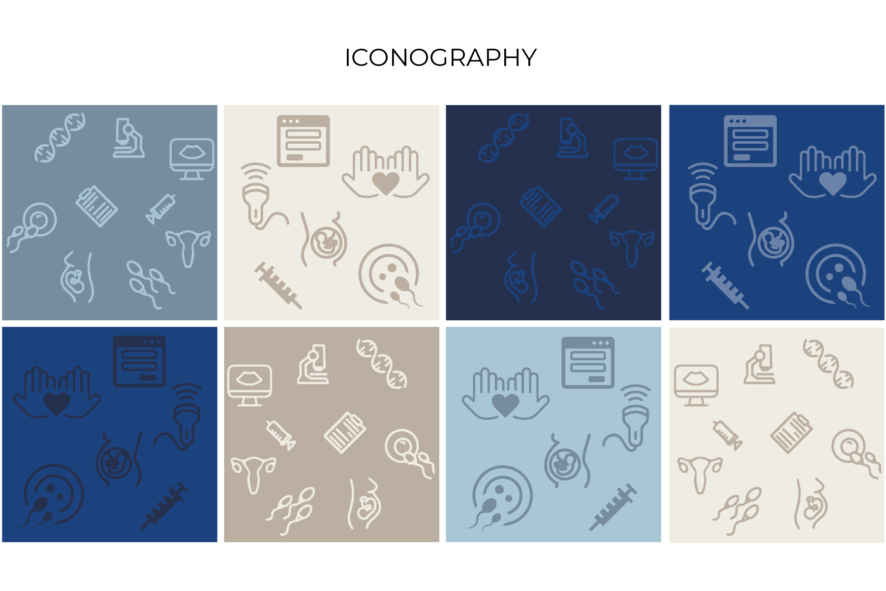
Through thoughtful color, typography, and iconography, we crafted a visual identity that feels human—not clinical—bringing a sense of care and connection to every touchpoint, from the brand guide to the website. Embedding the hidden "F" in the wing of the stork to personalize their icon. Using blues to resonate with the health industry while relying on warm accents to create a sense of empathy in the brand. Finally, the typefaces were chosen to maintain a clear, professional look with subtle flare in the display font to add the brand's personality.