Danko Foods inc. specializes in Elevating Culinary Excellence with the Finest European Imports
Danko Foods isn’t just selling ingredients—it’s curating the fine dining experience. The brand identity was built to reflect that same level of refinement, with a sleek, elevated aesthetic that speaks to quality, heritage, and intention. From its minimalist palette to the expressive type and mood-rich photography, every element is designed to evoke luxury rooted in tradition and brought to life through modern execution.


THE intent behind brand
The bold sans-serif display font signals modern sophistication—confident, clean, and high-end—while the gothic typeface adds heritage and gravity, grounding the brand in timeless European tradition.
A black-and-white foundation evokes restraint and luxury, letting the products shine. The refined blue accent introduces trust, tradition and the care in sourcing each ingredient.
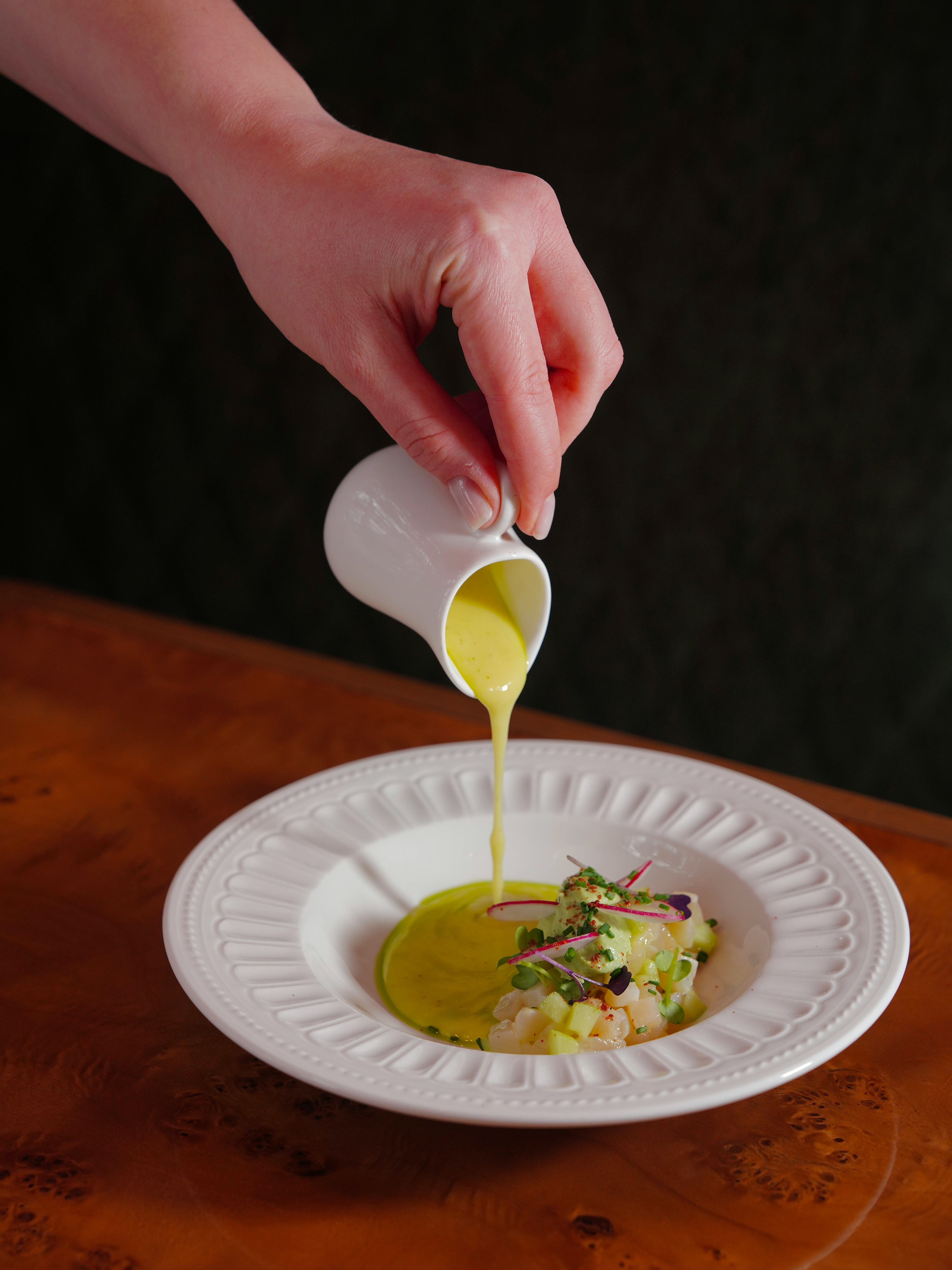
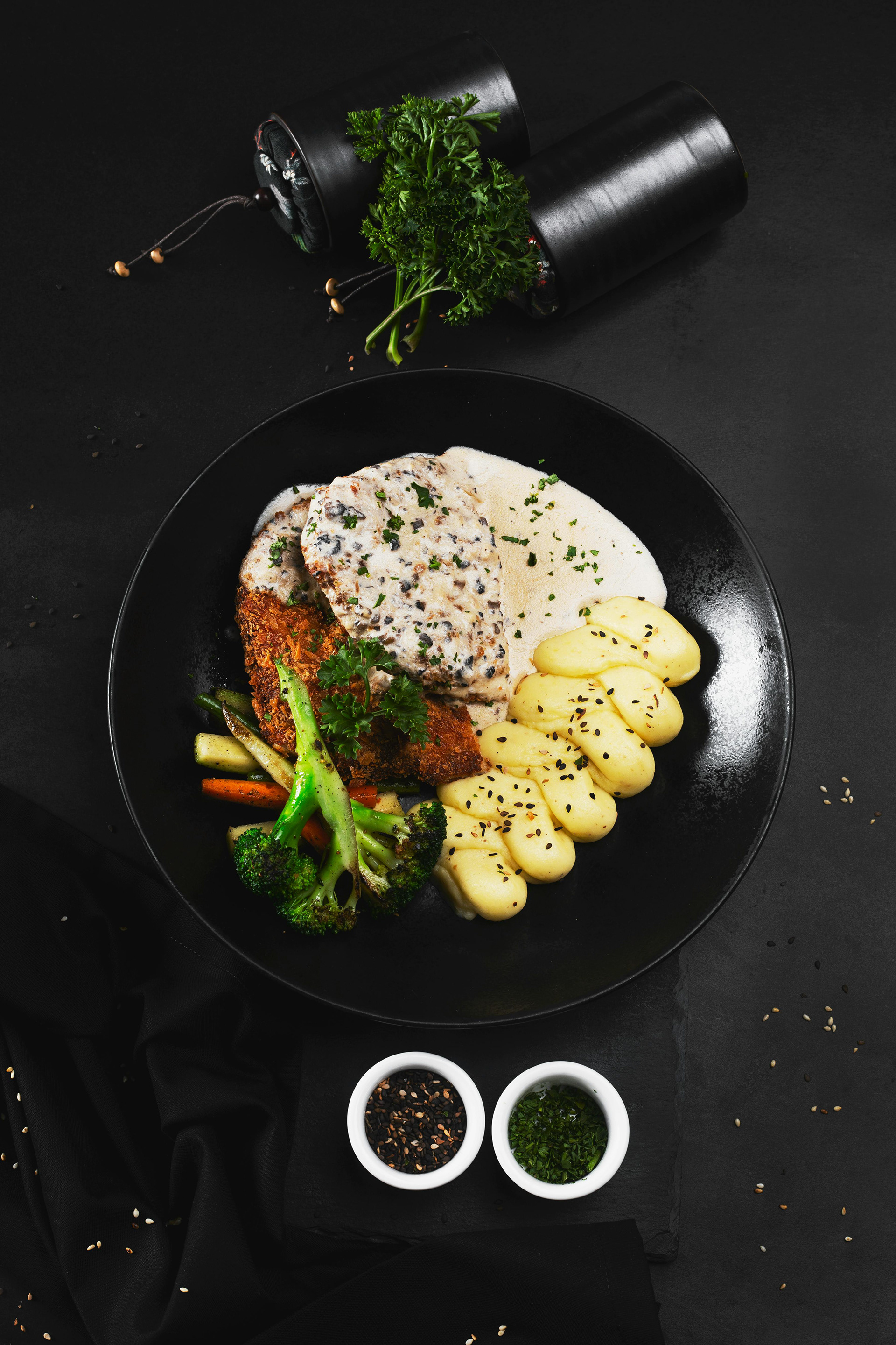
The imagery captures more than ingredients—it stages an experience. Every image is curated to evoke the ritual of fine dining: mood, ambiance, and indulgence without excess.
